
React development: Adding CSS frameworks
How to develop React webapps in style
In most web applications, developers tend to use CSS frameworks to aid them in creating nice looking and functional styling. While there are many of these frameworks, the most popular and commonly known framework around is by far Bootstrap. Therefore, we will start this blog by taking a look on how to add Bootstrap to our React webapp. Note that Bootstrap 5 is set to be released in late 2020, which should improved on a lot of things, including performance and not requiring JQuery.
For our example we will add the current stable release, which is Bootstrap 4.5. The documentation provides us with a guide on how to add Bootstrap to our application using webpack. Note that we will need to install four npm packages in order to add Bootstrap using npm. Namely: Bootstrap, postcss-loader, popper.js and JQuery. The guide also mentions the sass-loader package, but if you followed our previous React development blogs, this package should already be included in your application. Also note that Bootstrap currently still relies on the old and deprecated 1.x version of popper.js, so we should not use the newer and current package @popperjs/core.
Installing Bootstrap 4.5
Install these packages with the following command npm install bootstrap postcss-loader popper.js jquery. Alternatively, add the following lines to your dependencies in package.json and run npm install afterwards.
...
    "bootstrap": "^4.5.0",
    "jquery": "^3.5.1",
    "popper.js": "^1.16.1",
    "postcss-loader": "^3.0.0",
...
In order to let webpack perform its magic, we will also need to add a postcss.config.js file to our project. As per the installation guide, it should contain the following contents.
module.exports = {
    plugins: [
        require('autoprefixer'),
    ]
}
In our webpack.config.js we will need to add postcss-loader to our list of loaders related to CSS, SASS and SCSS files. When we add our loader, it should look as follows:
...
            {
                test: /\.(sa|sc|c)ss$/,
                exclude: [/node_modules/],
                use: [
                    {
                        loader: MiniCssExtractPlugin.loader,
                    },
                    'css-loader',
                    'postcss-loader',
                    'sass-loader',
                ],
            },
...
Finally, we will need to add the following line to the top of our existing App.scss file in order to actually import Bootstrap to our webapp.
@import 'bootstrap';
...
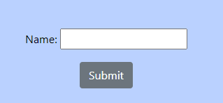
We should now be able to use all of Bootstrap’s functionalities (assuming we ran npm install after adding the new packages). In order to check this, we can alter our submit button in our previously constructed form. By adding the following property className=’btn btn-secondary’ and running our application (using npm start), we should now see a button styled with a greyish colour, as per the Bootstrap documentation for secondary buttons.
We have now added Bootstrap using the official guide. There are however, alternatives for adding Bootstrap to your application. For example. the npm package react-bootstrap aims to simplify the installation process by providing a re-implementation of the Bootstrap components, which can be used directly as React components. Using this package instead, could potentially aid the speed of your implementation process.
While Bootstrap (as well as react-bootstrap) is a very versatile CSS framework, that also provides a bunch of useful classes for things like buttons (as shown in our example above), Alerts, etc. We might want to have a more customizable CSS framework that we can use to completely alter our components to our needs. (The same goes for different CSS frameworks such as Bulma, Semantic UI and many other CSS frameworks)
Adding tailwindcss
Enter tailwindcss, a utility-based and fully responsive CSS framework, designed in such a way that the developer can take full control of the design of its components. What I personally like about tailwindcss , is that its classes can be easily customized, or enhanced upon using a simple configuration file, giving you full control over your styling.
For the following example, we will revert back to the state of our application before we added Bootstrap. We will mostly follow the tailwindcss installation guide. In order to add tailwindcss to our application, we need to add two npm packages. Namely: tailwindcss and postcss-loader (which we also needed to add in our Bootstrap example). Either run npm install tailwindcss postcss-loader or, alternatively, add the following dependencies to your package.json:
...

    "postcss-loader": "^3.0.0",
    "tailwindcss": "^1.4.6",
...
We will again need to add a postcss.config.js file, which will be slightly different to the one we made in our Bootstrap example, since we now also add a line to require tailwindcss. The file will look as follows:
module.exports = {
    plugins: [
        require('tailwindcss'),
        require('autoprefixer'),
    ]
}
In our webpack.config.js we will also need to add postcss-loader to our list of loaders related to CSS, SASS and SCSS files again. Check the Bootstrap example above to see what this should look like.
Finally, we will need to import the tailwind components at the start of our App.scss and the tailwind utilities at the end. The imports can be done using the following lines:
@import "tailwindcss/components";

...

@import "tailwindcss/utilities";
Note that i do not import "tailwindcss/base";, which is mentioned in the guide. If we do add this import, tailwind will add a set of opinionated base styles called Preflight. Adding this line is optional, but will in turn change some of the default behaviour of the styling of some components. This will mainly be an issue when adding tailwind to existing sites or webapps.
Once we imported tailwind into our stylesheet, we can now access the default classes provided by tailwind, which can be found here. We can check this by replacing the .full-width class we made in one of our previous blogs. Instead we can use the tailwind w-full class. By changing the classname property in ExampleForm, removing the former class from our App.scss file and running our application we should not see any changes to our application (indicating that using the tailwindcss class has successfully replaced our former custom class).
We can also add custom tailwind classes, by adding a tailwind.config.js file to our application. Postcss will read the configuration file and process it into the correct tailwind classes. We could for example add our background colours into this file. If we add the following contents to our configuration file:
module.exports = {
  theme: {
    colors: {
      primary: {
        100: '#bad1ff',
        300: '#98bcff',
      },
    },
  }
}
The provided colours will be available in all colour related classes. We can now use these colours in our webapp by providing the correct classes or we can change our App.scss and apply our classes directly. For our .App class in our stylesheet we can now remove the background-color : '#bad1ff'; property and replace it with the following line
@apply bg-primary-100;
As shown, adding CSS frameworks to a React webapp using Webpack is pretty straight forward and is never limiting the developer to just using a specific framework. The corresponding code can be found on Github (tailwindcss, Bootstrap).
In the following, final blog, we will take a look at hooks, one of the bigger more recent changes to React, and showcase a small example on how to use them.